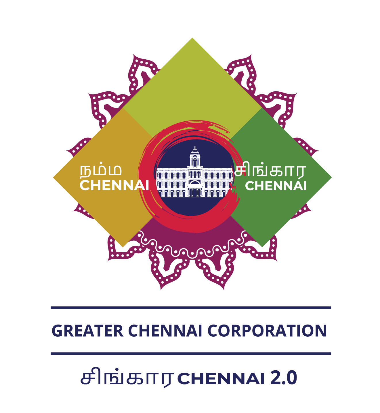
The Activity Label or Logo depicts quality, stability and balance. Symbolises that Greater Chennai Corporation is passionate about sustainably building happy, green, wealthy Chennai, strengthening culture through art and conserving nature.

The Upward thrust arrow shows the growth. Yellow represents happiness, light green represents nature, and dark green represents wealth.
The overall shape represents dynamic, energetic and active nature of quality executions.
GCC (Ripon Building) is represented as the authority on the Blue background representing credibility of the corporation.
The red circular artistic stroke represents power and the focus on sustainability of the city.
The kolam/motif behind the label represents the culture of the place. The shade of purple colour inspires creative participation of the society.
Concept, Strategy & Designed by Kartick Hari.
